What it is. A simulation platform for practice-based learning, where teams build their own business simulations.
Forge is a simulation platform for practice-based learning: safe-to-fail scenarios where people make decisions, see what happens, and go again. Short drills for a single skill — objection handling, discovery, giving feedback — and full scrimmages for the strategic, cross-functional stuff: pipeline, forecasting, leading through change. Built for sales enablement and leadership teams who are done with PDFs.
Forge’s customers include Salesforce, GE Aerospace, ConocoPhillips and Procore. We designed the product their teams run on.
The challenge
Simulations used to mean a consultant, a long lead time, and no way to touch your own content afterwards. Forge’s answer was to hand the whole thing over — design, delivery, measurement — which left us one rule: the builder must never turn into something only a consultant can use.
Our part
Startup Ventures, a development-focused company and a long-time client, brought us in to lead design from day one — going on two years: the early prototypes and wireframes, the task flows, then interaction, visual and experience design across the product as it grew. Along the way, the research that kept it honest — stakeholder sessions, end-user UX studies, usability testing — and the QA to make sure what shipped was what we designed, with the Forge team at every step.
What shaped it
- A builder, not a brief. Rounds, resources and decisions laid out so a learning team can design, reuse and evolve a simulation without waiting on anyone.
- Two delivery modes, one product. Self-paced and facilitator-led reshape the interface rather than bolting on a second one.
- Nineteen resource types, one shell. Scenarios, strategy groups, information gathering, allocations — every kind of decision rendered through the same pattern, so the builder never sprawls.
- Feedback that lands. Impacts on every decision, editable in place; results people see immediately and carry into the next round.
- AI role play. The conversation itself, practised live, with more on the horizon.
Two years on, Forge is still changing shape, and we are still on it. The only thing better than the product we helped design is the leadership: pure genius and moxie.
unspun
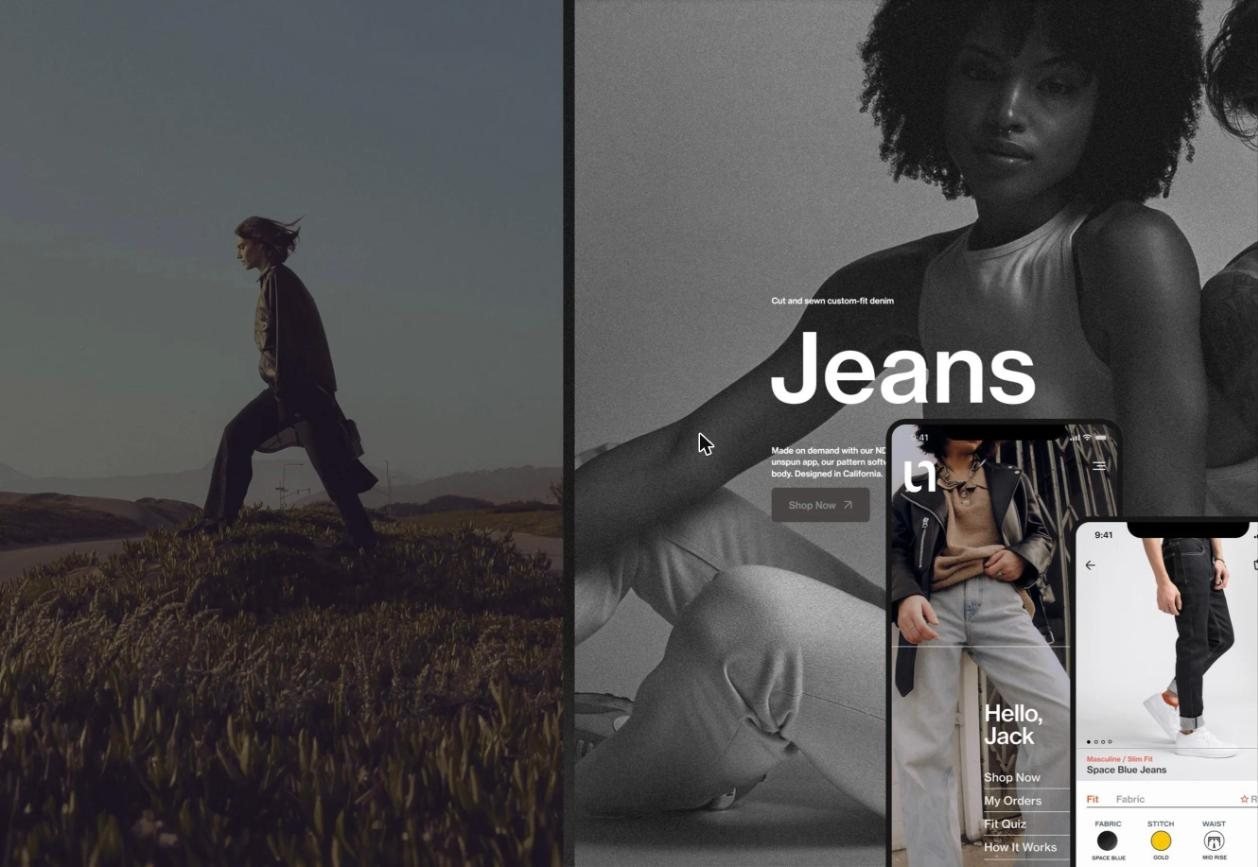
Jeans you can’t try on, cut from a scan you did yourself. We made that feel reasonable.
Fashion techWeb, mobile
What it is. Made-to-measure jeans, cut from a body scan you take with your phone, ordered through an app.
A startup in San Francisco, Hong Kong and London rebuilding how clothing gets made: scan your body with a phone, get jeans cut to it, skip the landfill of returns. Then 2020 arrived, the stores closed, and the whole business had to move into an app in a hurry.
The challenge
Nobody had shopped like this before. Scan yourself, trust the scan, pay for something you can’t try on, and wait. Every one of those steps is a polite invitation to close the tab. So the job wasn’t screens. It was trust: making a futuristic process feel like the obvious way to buy jeans.
What shaped it
- Anticipate the hesitation. Map where a person is likely to stall and solve it before they get there.
- Progressive disclosure. Just enough at each step to keep moving. Never the whole manual at once.
- Emotional assurance. Feedback, messaging and cues that keep saying: this is working, you’re fine.
- Natural behaviour. The scan had to fit how people already hold and move a phone, not the other way round.
- Low cognitive load. Fewer decisions, lighter ones, so attention goes to the jeans.
- Close every loop. Immediate, legible feedback on every action, so doubt never gets a foothold.
What we did
Fifteen months, hands-on. A full refactor of the early concepts into a new buyer journey, a beta release, then weekly sprints run on beta feedback sorted by impact and effort. After the experience work, the visual one: a rebrand, the iOS store and scanning UI, the web pages across four breakpoints, and the design system underneath.
If you’re still hunting the perfect jeans in a chain store: try the scan. You won’t go back.
Research & concept
Intel + Chrysler
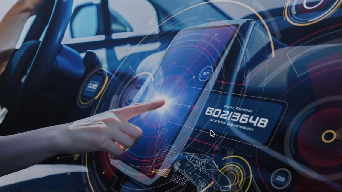
Seventy miles an hour, eyes on the road, and a dashboard nobody had built yet.
AutomotiveIn-vehicle infotainment
A chipmaker and an automaker, in the room for the part nobody films — when the in-vehicle platform is still an argument rather than a product.
The challenge
The person is doing seventy and their eyes belong on the road. Being wrong late here costs a model year. So the question was how to be wrong early, cheaply, with real people in a real-feeling car.
What shaped it
- Start in the home, not the car. Ethnographic research on how people actually live with their vehicles, and where the car sits among their other spaces.
- Synthesis in the open. Co-creative workshops, personas, how-might-we framing, hero scenarios. The teams argued with the findings, not about them.
- Paper first. Low-fidelity screens printed and put in front of people before a line was built.
- Build the cockpit. “Skyline”: a prototyping platform in Unity 3D — multi-touch, text-to-speech, animation synced to a driving scenario.
- Test in the simulator. User experience assessments with subjects in a realistic 3D rig, feeding requirements straight back in.
Those studies went on to shape in-vehicle infotainment across the Chrysler lineup from 2020 onward. We’ll take that.
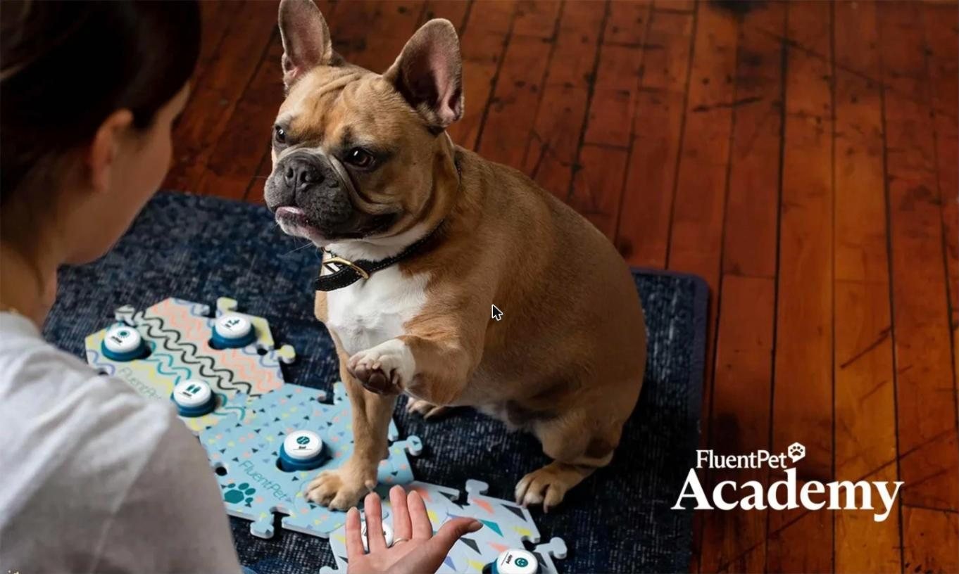
Fluent Pet
Pets can talk. Wait, what? Teaching one takes a person who sticks with it past week two.
Pet techMobile
What it is. An app and sound buttons that teach dogs and cats to “talk”, with training that keeps people going.
Fluent Pet is about teaching your pet to talk. Sound buttons let a dog or cat press words to tell you what they want, with real cognitive science behind it and a Netflix series in front. We defined the framework for the future of their app: Duolingo-style training that keeps people going.
The challenge
Most people give up around the two-week mark, which is, inconveniently, right where the product starts to work. Training difficulties were turning into lost sales, so the brief wasn’t a prettier app. It was getting people past week two, to the moment they hear their dog or cat press a button for a word it knows. That moment is priceless.
What shaped it
- Map the whole journey. Stakeholder and customer interviews, then a full customer journey map — where motivation runs high, where it collapses at the two-week plateau.
- Design for the plateau. What has to happen at exactly the point people quit.
- A framework, not a course. Modules shaped to Fluent Pet’s existing curriculum and resources, personalised by pathway.
- Keep the loop alive. Daily check-ins, quizzes, milestones, progress, community — the things that make week three happen.
- Show it on the device. Medium-fidelity mobile mockups so the developers could see the framework in context.
The Academy: designed from Q2 2024, built to get people past the point where most quit.

Virtual Gurus
The best hire you’ll make is the one most hiring skips. We designed a marketplace that doesn’t.
Talent marketplaceWeb app
What it is. A virtual staffing company, Canada’s version of Upwork: a marketplace that matches businesses with vetted virtual assistants.
A marketplace with a mission attached, deliberately drawing on talent that traditional hiring walks straight past.
The challenge
Two-sided, so two products that have to stay in step. And a brand that had to say “inclusive” without saying it — in the interface, where it counts.
What shaped it
- Two years, embedded. Fractional product design direction alongside the CEO, COO, CTO, CMO and product manager. The seat, not a vendor.
- Refactor, then refresh. The experience first; the UI and the rebrand once it was right.
- Matching you can see. Roles, hours and skills set up once, driving candidate results and selection.
- The work after the hire. A project view for hours, roles and discussions — where the relationship actually lives.
- A system to keep building with. Brand kit, colour, type, components, so the team didn’t need us for the next screen.
Talentplace, for both sides of the table. The UI is the pretty part. The matching is the point.
12 years+
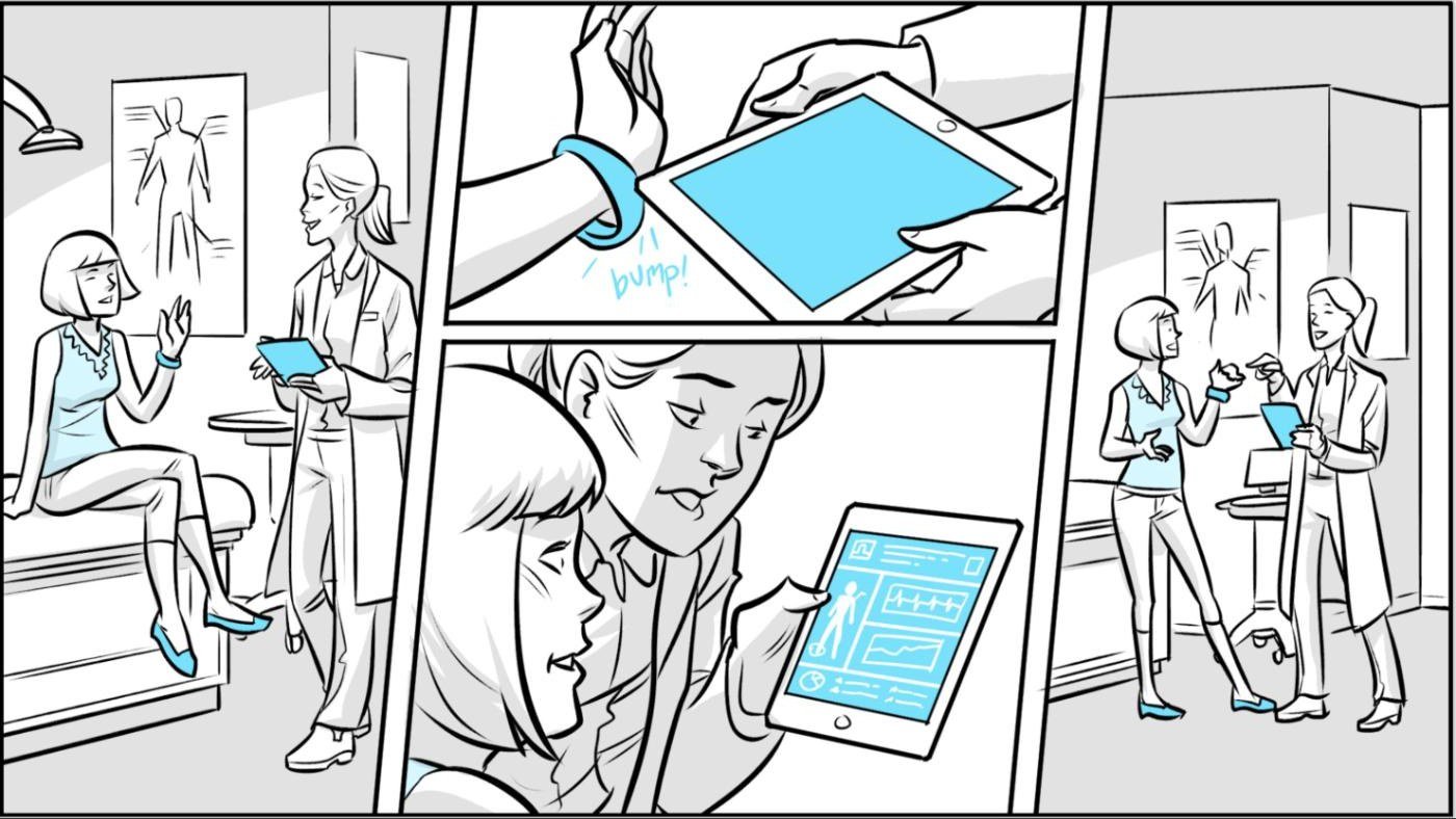
Intel
What is this silicon actually for? A chip company kept asking. We spent twelve years telling the story of the future that answered it.
Semiconductor & techIoT, wearables, automotive, AR/VR
Twelve years as a strategic design partner to Intel — Labs, IoT, 5G, Edge, Automotive, Marketing. Product strategy, visioning, usage mapping, experience design and prototyping, all in service of one job: telling the story of the future that drove the future of chip design forward.
The challenge
The brief changed every few quarters. Sometimes the product was five years out, sometimes twenty. We used whatever fit the story and the moment — storyboards, demos, prototypes, tools — and it was never a straight line. Budget and the calendar decided as much as the idea did, which is not how the origin story usually gets told.
What shaped it
- Usage mapping you can build from. Working with human-factors engineers and ethnographers, then turning findings into usage scenarios rather than slides.
- Prototype at breakneck speed. Design sprints that produced working things to react to — the fastest way to learn whether an idea deserved to exist.
- Storyboards as arguments. Concept films and sequences, the 5G demo for Mobile World Congress among them, that got rooms aligned.
- Software that reaches millions. Graphical BIOS for the extreme-gamer crowd, MyWiFi, the Platform Debug Toolkit — that last one the hardest design system we have ever met.
- A future to point at. From early IPTV and interactive widgets, to the smart home of the future, to autonomous vehicles. Each one a story of what people would do with the silicon, told early enough to steer what got built, and told with whatever the budget and the calendar allowed.
- Every surface. Automotive, wearables, television, robotics, toys, smart home, sensors, sports, AR/VR.
Whatever was in the chest got used. Still does.
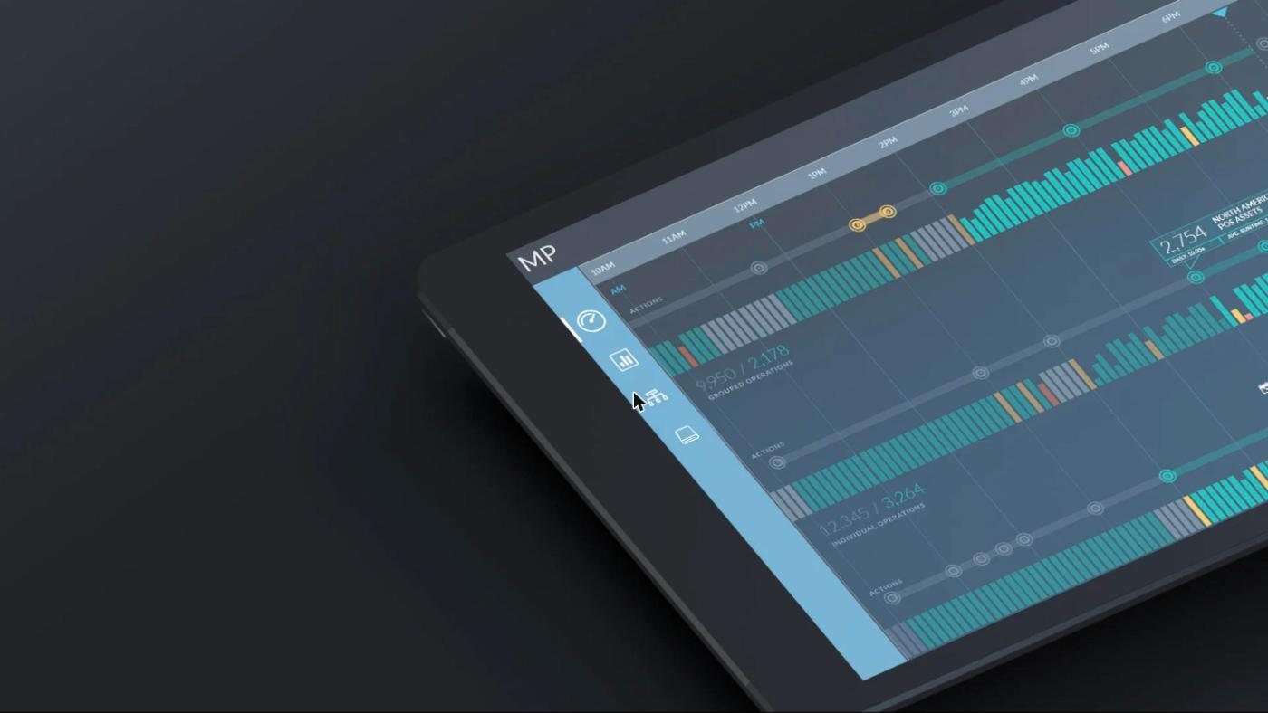
Tripwire
Thousands of machines, all shouting at once. One analyst. We made the right one audible.
CybersecurityEnterprise web
What it is. Enterprise security software that watches the health of thousands of endpoints and tells an analyst which one matters.
Portland’s own enterprise security company, with a product watching thousands of endpoints that all have opinions about their own health — and an analyst on the other end with too many tabs and not enough hours.
The challenge
A new enterprise dashboard, Tripwire for DevOps, that reads an environment’s state at a glance and reports what changed, without becoming one more thing that shouts. An alert nobody trusts is worse than no alert at all.
What shaped it
- Triage first. Built around how analysts actually work a queue, not how the data happens to be stored.
- Changes, not status. What moved since you last looked is the headline. Everything else is context.
- Annotated to build. Every wireframe carried interaction notes a developer could build from without a meeting.
- One framework, many products. Patterns designed to carry across the DevOps line, not just this screen.
- Light and dark, flat and responsive. A visual direction that sits beside the existing product family and still moves it forward.
What we did
Led the research and design team through weekly sprints with Tripwire’s UX and engineering: discovery, synthesis, the full wireframe model with interaction annotations, then the design direction and the dashboard UI itself — component kit and style guide included.
The design language has since gone on to other Tripwire products. The quiet kind of win. Our favourite kind.

Level Up Score
An evening of reading credit reports, gone. What’s left is the part that mattered: the plan.
Financial servicesWeb app
What it is. Software for credit repair professionals that turns three-bureau credit reports into a client’s action plan.
Credit repair professionals were reading three-bureau reports by hand and writing every client’s action plan from scratch. An evening per client, at the end of a long day, with the advice only ever as good as how tired they were.
The challenge
The software reads the report and writes the plan in seconds. Fine. The hard part is the plan: a document a professional will put their own logo on and a client can act on without a finance degree.
What shaped it
- Design the output, not the parsing. The handoff is the product.
- White-label by default. It has to look like the professional’s, because it is.
- What to do first. Then why it matters, then what happens if they don’t.
- Plain language. Advice is only useful if the client can follow it.
An evening of reading, gone. The judgement stays with the professional — which was the point.
FIBA
Bring the fan closer to the live game than the broadcast ever could. Court cams, drones, second screens — the tech that exists, and the tech that’s about to.
Global sportMobile, web
Basketball’s world governing body, and an executive who wanted the live game to reach fans in a way the broadcast never had — immersive, a little disruptive, on the big-screen TV and in the palm of the fan’s hand at once.
The challenge
Court cams, drones, player feeds, streaming, second screens: the technology that exists today, and the technology about to. Plenty of possibility; no shape. The job was to turn it into one fan experience a person could follow — closer to the court than a seat gets you — and a platform FIBA could actually build.
What shaped it
- Current tech, emergent tech, one experience. What streams today and what will in two seasons, designed as a single thing rather than a feature list.
- Design for the three days. Build-up, game, the argument afterwards. The live window is where it has to be unmissable.
- Co-create with the people who’ll fund it. A design-thinking workshop to define audiences, infrastructure and the technologies worth betting on.
- Map the ecosystem. Who’s involved, what they hold in their hands, and what earns a place on screen during the ninety minutes everyone is watching.
- Storyboard it. Usage scenarios drawn frame by frame, so the vision could be seen rather than described.
- Make the case. Infographics and a presentation built for the FIBA World Council in Geneva.
Product visioning, in other words: the kind where a room full of people leaves agreeing what the thing is.
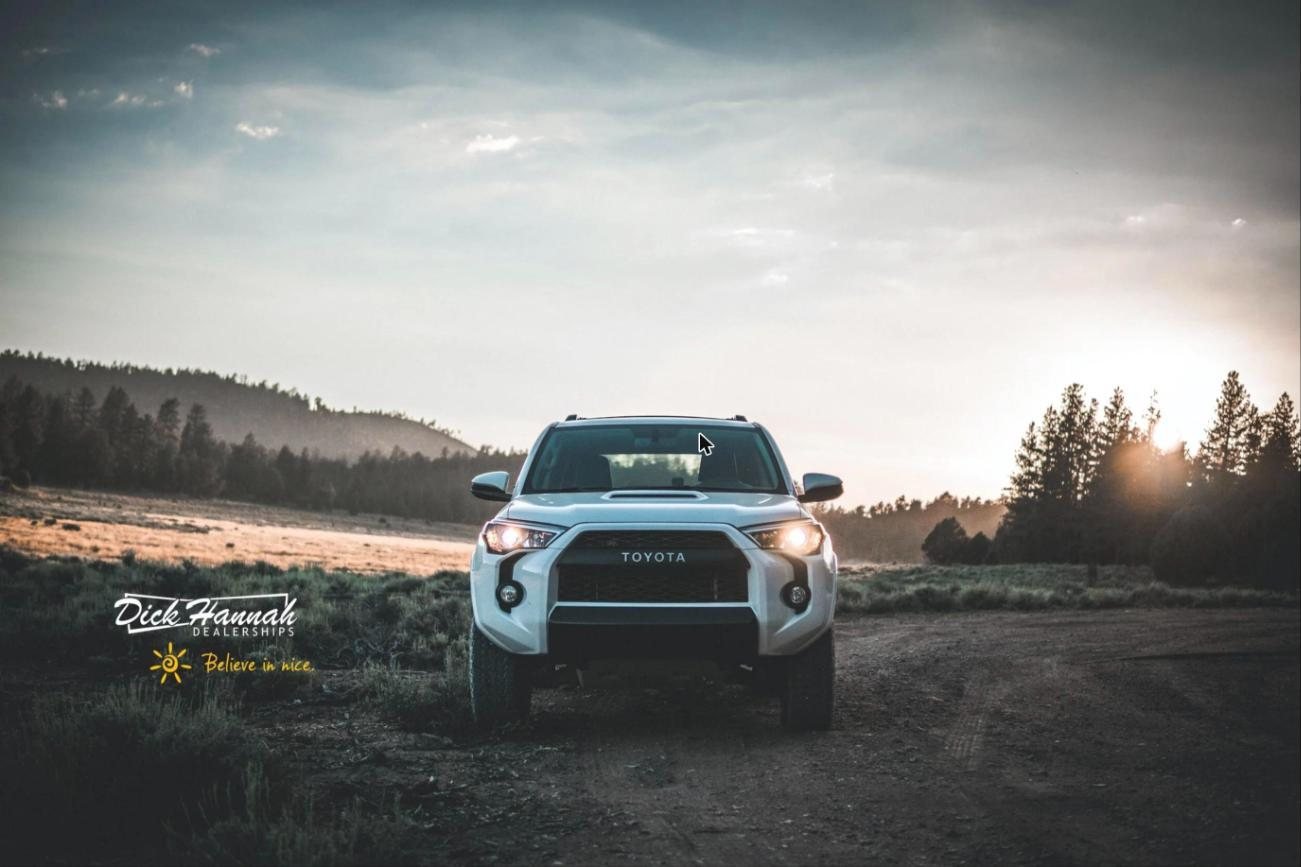
Dick Hannah
Buying a car is already terrifying. The website didn’t need to help.
Automotive retailWeb, responsive
The largest and oldest family-owned auto group in the Pacific Northwest: twenty storefronts, twelve manufacturer dealerships, eight specialty shops, seventy years of reputation and close to a billion dollars a year. And a web presence that a decade of growth had patched together one plugin at a time.
The challenge
Buying a car is high-anxiety and high-consideration. People research obsessively, then finish in person. The sites made that harder — confounding architecture, dead content pages, a buyer journey that misrepresented a company that is, in person, very good at this.
What shaped it
- Research before rooftops. CX research, stakeholder and customer interviews, personas, and design principles everyone could point at when a decision got political.
- One navigation for twenty storefronts. New, pre-owned, finance, trade, service — the same way in, everywhere.
- Buy from home, finish in person. A journey designed to hand off to a human, not replace one.
- A vehicle page that tells the truth. Price, incentives and financing legible enough not to read as a trap.
- A theme that scales. Corporate, dealership and specialty sites from one responsive template, so the next rooftop doesn’t need a redesign.
What we did
Nine months. The research and strategy, a full rebuild of the information architecture, experience and content strategy, then six months leading the UI: high-fidelity, responsive, across every property.
Seventy years of legacy, finally with a website that acts like it.
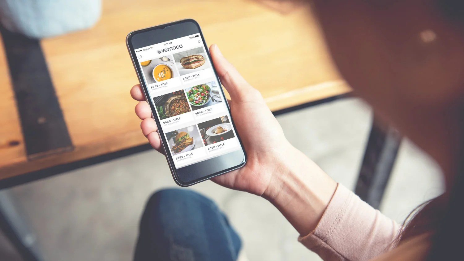
Vernaca
The owner is cooking, scheduling and running payroll. The marketing had better run itself.
Restaurants & small businessMarketing automation
What it is. Marketing automation for restaurants and small businesses: offers built once and sent out across web, email and social.
Marketing automation for restaurants and small businesses, where the person operating the software is also cooking, scheduling and running payroll. Vernaca was later acquired by SmartPickle.com, and the product now carries that name.
The challenge
The enterprise playbook — segments, funnel builders, an afternoon of setup — is exactly wrong here. Nobody has an afternoon between lunch and dinner service.
What shaped it
- Defaults that are already right. The product should work before anyone configures it.
- Few decisions. And only the ones that matter.
- Runs while they’re away. Automation that keeps going when the owner doesn’t log in for three weeks.
- Direction, not just screens. We set the design direction the product could be built against.
Built for someone who shouldn’t have to think about marketing. That’s the compliment.
Ondaka
The mixed-reality demo is the part everyone films. We designed the part that makes it a product.
Industrial techMixed reality, web
What it is. Software that puts real infrastructure in front of decision-makers in 3D and mixed reality, for heavy industry and energy.
A Palo Alto startup putting real infrastructure — pipelines, plants, as-built equipment — in front of the people who have to make calls about it, in 3D and mixed reality, for the heavy industrial and energy sector.
The challenge
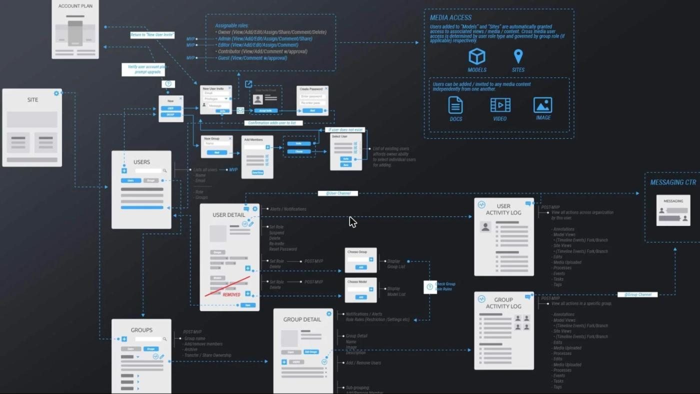
The visualisation is the demo. The product is everything around it: who can annotate a model, who can see it, who can change it, and what happens to all of that afterwards. Spatial thinking for the headset; plain old rigour for the rest.
What shaped it
- XR guidelines first. A platform-wide set of design principles, so the team could design in space consistently.
- The content model. How a model gets notes, documents, images and lists attached — and keeps them.
- Roles and permissions. Who sees what, who can change it, and the account and group administration behind it.
- Task flows for everything. Start to finish, decision points and pain areas marked, feeding specs for web, tablet and mobile.
- Nearly two years as Product Design Director. Experience and visual design, across all three platforms.
Along the way, a “Most Promising” finalist at the Offshore Technology Conference. The pipeline got the applause. We’ll take the product.
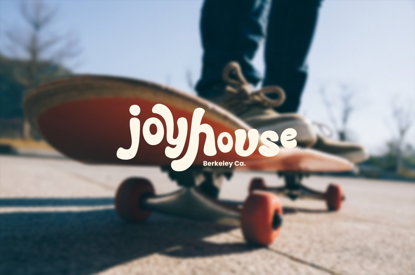
JoyHouse Berkeley
A brand and a website for a faith community in Berkeley that wanted both to feel like the people in it.
BrandWordmarkWebsite
JoyHouse is a faith community in Berkeley, California, and a client that needed a brand and a website to match their culture. Not your typical faith-based organization. They understood that their culture and their brand needed to connect, and they asked for both to be built that way.
The brief
A brand that personified joy and the warm, fun culture of the community, and also paid homage to the Bay Area and the geography around it. Sunshine, earth, sand and blue sky were the inspiration.
Our part
The full wordmark and the brand system around it, from the logo and its colorways to the photography and lettering, and how it all lands on a letterhead, a notebook, a welcome card, a lanyard and the website.
What shaped it
- A wordmark with a wave in it. Soft, rounded letters that lean into each other, with “Berkeley Ca.” set small and plain beneath.
- Colors from the Bay. Sunshine, earth, sand and blue sky, as Deep Sea, Sea, Sand, Sunset and Sun, with Sandalwood as the accent. The logo works in each pairing.
- Imagery that feels real. Candid, human, rooted in place: friends laughing, city streets, the coast, community gatherings. Berkeley’s street grit meets the California coast, in warm light and film-like texture.
- Hand-drawn lettering. Kind words and sunshine, drawn loose, to sit alongside the photography.
Tangent.ai
A new face for a beauty brand, and a website to go with it.
BrandDesign systemWebsite
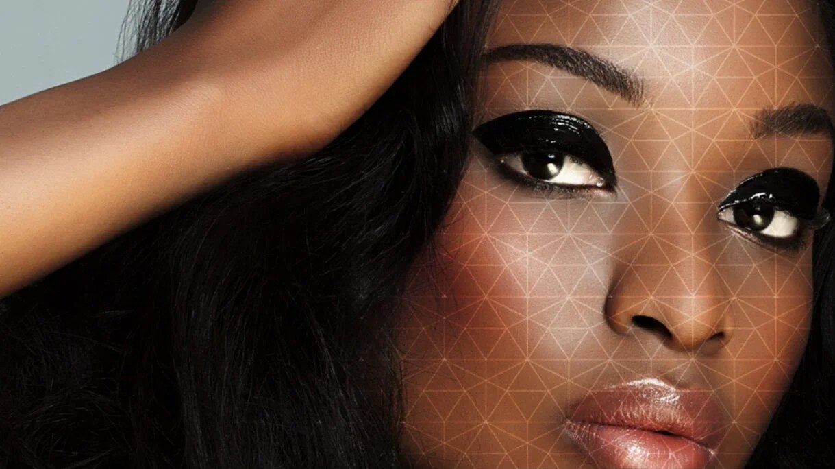
What it is. AI-driven skin and hair analysis and virtual try-on, sold to beauty brands.
Tangent.ai is a San Francisco start-up with a B2B, AI-driven application, and it needed a brand and a web presence to go with it. They wanted a distinctive technology lifestyle brand that would be noticed, and one that represented the product honestly to the people who would use it.
The brief
A strong brand and a website that spoke to their audience and set them apart in a crowded field. Fashion-forward and a little edgy, without losing the technology underneath.
Our part
The brand identity, style and mood boards, creative and art direction, the design system and the website design, with the project and team managed alongside.
What shaped it
- Style boards before screens. Two directions set color, typography and imagery up front: one bold, structured and futuristic, the other modern, layered and organic. The final selections became the reference for the website, presentations, marketing and advertising.
- Three comps, one site. Several web comps went to the client for critique, and the final design pulls the best elements of three of them together.
- A figure in balance. A simple mark beside a confident wordmark, with “Insightful virtual beauty” set small beneath.
- Live today. The site is at tangent.ai.